Inspired By: Katie Rosenfeld
Do you ever come across an image that just stops you in your tracks?
I shared this photo of an entryway by
Katie Rosenfeld
in last week's Love List. It's an image that I can't quite get out of my head.
There is something about how the designer has pulled patterns and accessories
together that just appeals to me in a way that feels fresh, timeless, yet
current.
I'm in the mood to add some spring decor in the front entry so this is great
inspiration. I thought I'd start a new series, "Inspired By" where I take an
image and recreate, reinterpret, and take cues from it in my own way.
Spring Decor for the Front Entry
Before I show you my versions, let's break down what we're seeing here:
- The wallpaper features a mid-size pattern with a dense repeat. It's kept from being too overpowering in this space by pairing with white beadboard wainscotting
- A solid dark console provides contrast against the wainscotting and grounds the space
- The general dark and light tones are repeated in the wallpaper and flooring
- There's a range of pattern sizes: mid size on the wallpaper, large on the checkerboard floor, and small on the rug
- The natural tones of the bench, armchair, and planter provide some warmth
- The fern, textiles, and small floral arrangement and texture
- The gilded frame really helps the artwork stand out
- The art itself features very little whitespace
- The lamp has an interesting narrow, bamboo profile. It echoes the legs of the console and lines in the beadboard
- Subtle gold accents are found throughout the space, in the flushmount lights, the frame, and the handles on the console
Did you notice all that in the photo? When you take inspiration from an image
like this, it can really help to find out what resonates with you. Perhaps
it's the dark and light contrast, or maybe it's the play of pattern sizes. You don't need to be literal and use the same materials or objects. Just keep the ideas you like in mind as you put together your look.
Here's a few interpretations I came up with. As you can see, they're not all
"my" typical clean, preppy, trad style. But that's the thing about studying
the work of great designers. You can be inspired to push yourself creatively
in new directions.
Which of these looks is your favourite?
Palm Springs Contemporary Entryway
This Palm Springs inspired look is all about the curvy shapes and playful
colours. The modern art and large scale wallpaper serve up bold looks. The
rounded lines of the art deco table lamp (in LOVE with this piece!), the
inlaid console and the sweet scalloped rug signal that this is a home that
doesn't take itself too seriously.
SHOP THIS LOOK:
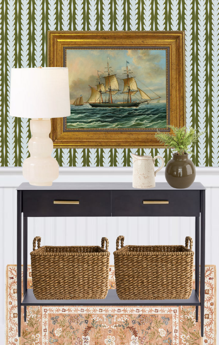
Organic Traditional Entryway
Classic style but make it textured. Floral patterns are reinterpreted in
modern colourways and paired with organic, natural shapes and materials.
There's a balance of old and new, clean lines and soft shapes with this
look.
SHOP THE LOOK:
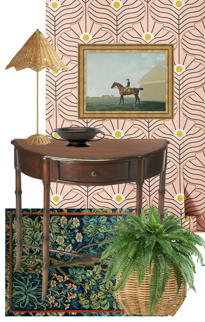
Traditional Maximalist Entryway
If your mantra is "more is more", then this is the look for you. A bold
pattern with a dense repeat is a modern foil to a traditional William Morris
inspired vinyl mat and a classic demilune console table. The accessories
hold their own. The sophisticated rattan table lamp, fluted bowl, and
planter with faux fern are attention worthy while the artwork provides a
place for the eye to rest.
SHOP THIS LOOK:
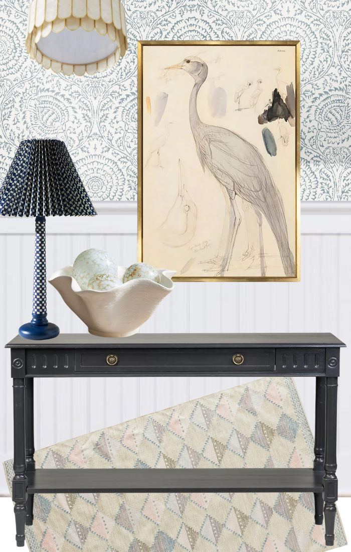
Sophisticated Coastal Entryway
When bold patterns just aren't your thing, this soothing entryway in tones
of surf blue and warm cream might be more appealing. The capiz shell light,
shell accessories, and crane artwork definitely bring a coastal vibe. Keep
it from getting too themey with a large scale medallion wallpaper and fluted
console.
SHOP THIS LOOK:


