Client Design - A Kitchen Consultation
Are you confident in your design choices? Do you feel like you know what you
want to do in your home, but could use a sounding board or someone to bounce
your ideas off of? You're not alone.
"Hi there. My husband and I are looking at doing our kitchen this fall with Ikea boxes and Kitch fronts. I was very confident going into the planning, but my real estate agent suggested leaving the current tile flooring and this has made me less confident!
I'm good with the design/layout, but what I would be
looking for is help picking cabinet colour to go with the tile floor, should
the cabinets be one colour or two and help with countertop colour."
Whitney reached out to
me last year. She had some great ideas and knew how she wanted her room to
look and feel, but could use some help in pinpointing the details and bringing
the whole look together.
eDesign Consultation
I work with clients providing primarily eDesign (virtual) services. eDesign
doesn't need to be expensive, time intensive, nor intimidating and it's perfect for dilemmas
like this where you're looking for quick answers to very specific questions. I
suggested to Whitney that my
Instant Advice service
was what she needed.
This one-hour design consultation is done live over video. In that time,
Whitney was able to
- give me a walk through of her kitchen layout
- shared how her family used the room and how it needed to function
- explained to me which cabinetry, furnishings, and finishes in the room were staying and which she was looking to replace
- shared the cabinet and countertop options she was considering
Prior to our call, she shared photos of her existing flooring and cabinetry
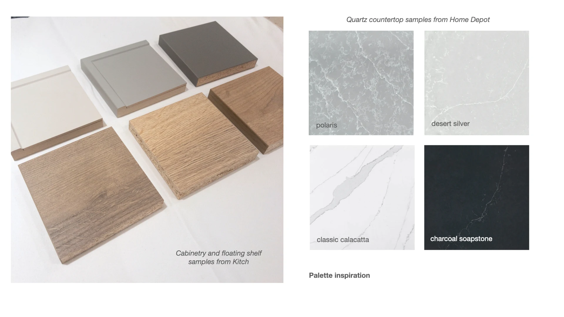
and inspiration images. I pulled together Kitch cabinetry samples, paint
swatches, and hardware I thought would work in her space and we walked
through those options on our video call.
The focus of the call was to narrow down the materials and palette and provide clear direction on how to achieve the look she wanted.
Kitchen Mood Board Ideas
After our call, I provided Whitney a presentation showing three different
mood board ideas we had discussed. This gave her a visual guide she could
refer to as she moved on with her project.
Having a reference in hand helps eliminate the doubt you might feel when pulling together a room on your own. As well, you can share mood boards like this with suppliers who can then suggest which of their products would work for your design.
Let me show you some of the design schemes I created in the span of our one
hour call:
Option 1: The Traditional Kitchen
This option makes use of classic elements like the Calacatta marble pattern,
brass hardware, and the greige
Mist cabinetry
colour.
The
Calacatta is actually a quartz material which gives you traditional look of
marble with easier maintenance. The light Mist colour is a neutral that is
easy to live with and coordinates with the tones in the existing flooring.
Painting the walls in a warm white and accenting with natural wood accents
and a vintage rug will create a warm, classic kitchen.
Option 2: Moody Masculine Kitchen
This kitchen plays with a high contrast palette. The
charcoal soapstone quartz is rich and commanding. Pair it with cooler hardware in brushed
nickel and a deeper hued cabinetry colour for a contemporary feel. Sticking
to a monotone runner and light grey walls allows the cabinetry to stand out
and be the centre of attention.
Option 3: Rustic English Kitchen
If natural and organic materials are more your style, you might like this
mood board for a rustic kitchen. The mid-tone taupe cabinets in Haze provide
just the right depth of colour without being too bold. Balance that with
white walls (Simply White by Benjamin Moore
would work beautifully) and accessories with texture and patina. Aged brass
hardware completes the look and gives this new room a sense of history.
What do you think... which option would you choose?
In the end, Whitney ended up replacing the tile flooring after all, but the
kitchen cabinetry schemes we discussed provided the reassurance she needed
as made her selections. And the results were beautiful! Have a look:
The kitchen is warm, inviting, and flows beautifully with the rest of her
home. I'm thrilled to have helped Whitney create this room for her family.
Are you hesitating on your next home project? Reach out and let's talk about
what you need to get moving forward!


