A Bright and Neutral Basement One Year Later
Last year,
we renovated our basement. It was a big undertaking that involved framing out a wall, installing new
flooring, adding a kitchenette, updating a fireplace, new lighting, paint,
decor, and wallpaper. Basically, a top to bottom renovation.
And we've loved the basement! We love spending time there as a family and
functionally, it meets our every need. But there was one aspect that over time
began to bother us so we made some changes. Come have a look at our newly
neutral basement.
That's right, we've replaced the blue wallpaper. The
Antique Kayaks Blueprint wallpaper
was bold and fun and worked with our nautical theme, but I've come to realize
I am not a bold wall person.
It's not entirely a surprise. I once painted a dining room wall (just a single
accent wall!) a deep claret red, and within a week, I realized I could not
live with it and repainted it.
The blue wall, while pretty, always commanded attention. It jumped out at you
as you came down the stairs and was the first thing you would notice. Even
when we were sitting in the dark and focused on the television, in the midst
of a marathon Netflix binge, the wallpaper would call out "Hey! Look at me!".
It had to go.
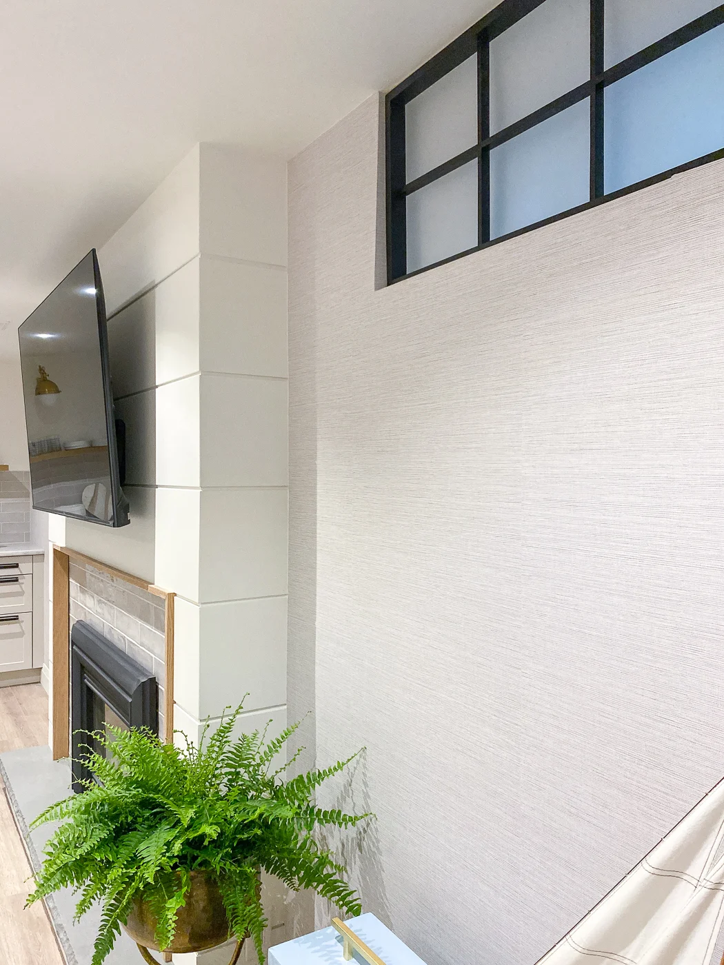
We replaced it with this gorgeous faux grasscloth,
Agave Bliss Light Grey Faux Grasscloth, from Brewster Home Fashion. I've used Brewster wallcoverings before, from
the
blue and white toile
in my office, to the
modern gingham at our cottage bedroom, to the
faux blue grasscloth in Chloe's bedroom, and have always been impressed with their products.
Here you can see the wallpapers I considered. They have so many great
grasscloth options! The Agave Bliss faux grasscloth is the "Paste the wall"
variety and as I've written in the past, it is the
easiest kind of wallpaper to install, even for beginners.
Looking for wallpaper for your home?
Use code RAMBLINGRENO to get 10% off your order at
Brewsterwallcovering.com until
August 12th
Taking down the old wallpaper was a chore as it removed some of the drywall as
well and we had to paint and repair that before we could apply the new
wallpaper. I shared the entire process
in my Instagram stories
if you're interested. To prevent this from happening again, we applied a coat
of
Zinsser Shieldz wallpaper size. It helps with wallpaper adhesion and also ensures easier removal later
on.
You can see how the grey grasscloth blends in with the rest of the accessories
and creates more of a monotone palette. I especially like how it picks up on
the light taupe tile on the fireplace surround and the kitchen backsplash.
I also like how the faux black frame window inserts pop against the lighter wallpaper. This was an easy DIY project that helped to make this room feel less like a basement. The frosted
acrylic still allows the diffused light to shine in and casts a nice blue hue.
I've toned the accessories down as well, shifting from a blue, light peach and
white scheme to a grey, peach, and white palette. The feeling is still light
and coastal, evoking the colours of sand, soft surf, and sun-kissed cheeks.
My single peony bush bloomed just in time for these photos. The soft pink and
coral blooms fit in quite nicely and bring in a bit of life to this
basement.
I've switched out the chairs around our games table as well. The
striped armchairs moved back to our upstairs kitchen. In their place, I've put
these chairs. While they're a good quality and a great price, I can't recommend them
because the company only shipped two instead of four chairs and it took me
dozens of phone calls and emails and six weeks of waiting to get the mistake
resolved.
To lighten things up, I've put away the skirted tablecloth for now. This round table has such a pretty base that its a shame to have it covered up all the
time. I will bring out the tablecloth and style the table later in the fall, just to switch up the decor.
The kitchenette that we added is probably my favourite feature in the
basement. The undercounter
beverage fridge and farmhouse sink get a lot of use. I repot and arrange my flowers
here so its proven handy to have a sink nearby.
There's also ample counter space to set up a popcorn station! You can bet that
has been put in use over the past year.
I'm debating whether to repaint the
craft room door. I specifically picked this colour to match the blue boat wallpaper so I
have the opportunity to pick an entirely different colour now. I could go
light? Or classic black? Or coral? How fun would that be! What colour would
you paint the door?
I don't typically change things up very often, but I won't hesitate if things
aren't feeling or looking right. This feels calmer, cleaner, and more conducive to movie nights.


0 comments