The Love List
A bit of a different love list today...
I went to the Opening Gala for the Interior Design Show on Thursday night and was blown away by the design talent. I noticed a few recurrent themes in what I was drawn too. Trends? Time will tell. Here's what I loved at IDS (sorry for the quality of the pics!):
Ikea, along with two of Canada's top design magazines, Style at Home and House and Home, put together three stunning kitchens using Ikea's new Sektion line of kitchen cabinetry.
I have to say this black and white kitchen by Style At Home edged out the others as my favourite. This stunning kitchen looks plucked from the heart of Paris. There are so so many details to love... the oversized hex floor tile, glass doors paired with glass shelves, the repetition and symmetry of the cabinets, the chandelier hung in front of the giant mirror (doubles the light!)
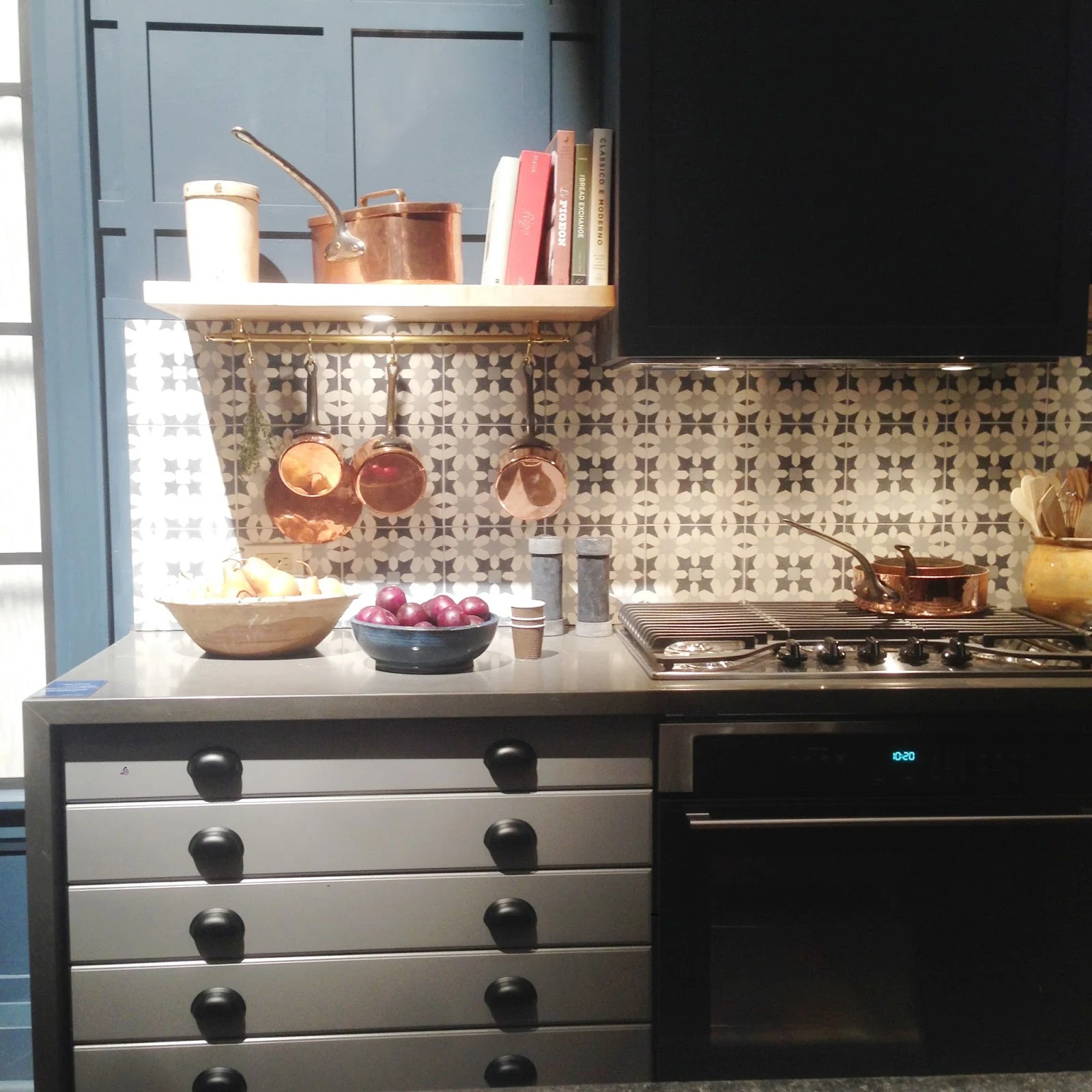
At the opposite side of the galley kitchen space, was more beautiful displays. I loved the brass rails from Richelieu which ran the length of the wall and along the front of the countertop. So clever and charming, especially paired with the copper pots. It's okay to mix metals!
In contrast, this kitchen by House and Home felt a little more rustic, a bit English country farmhouse. There were the copper accents again! I loved the angularity of the kitchen - the waterfall countertop, the rectangular range hood, the wall moulding, and the patterned tile.
The kitchen featured a pantry barely bigger than a closet. A great use of space! The pastoral wallpaper was a nice contrast to the simple shelving. I really loved the mossy green colour. And how about those metal and glass doors? So fantastic.
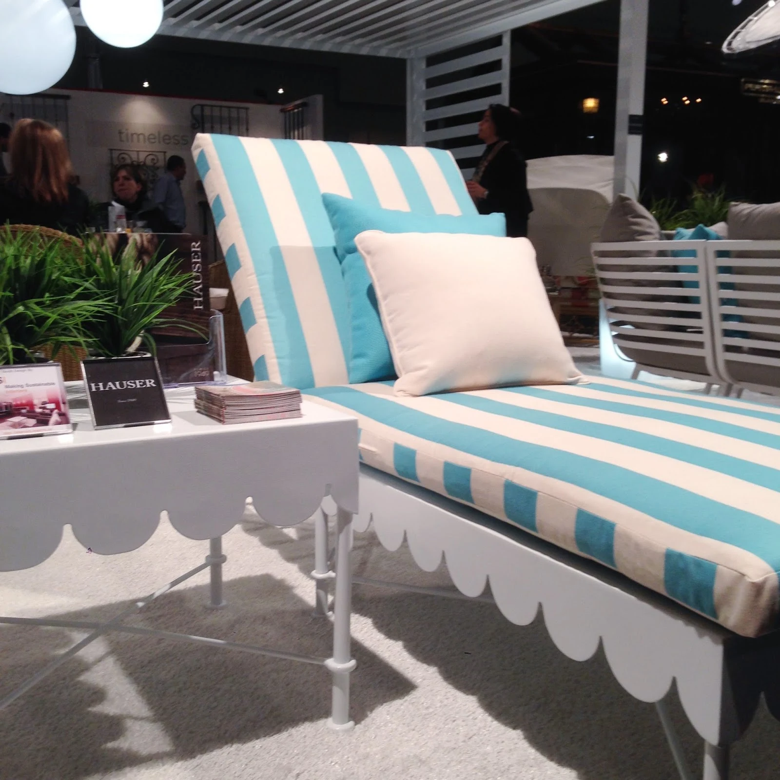
This chaise by Hauser caught my eye. I liked the scallop detail - very Palm beach with a touch of whimsy.
There was some really creative and bold lighting featured at the show. This piece by Lightmaker Studio was gorgeous. The picture doesn't capture it but they had the most amazing filaments in the their bulbs.
A fun rope light (literally) by Atelier Nomade.
These minimalist lighting pieces by MSDS Studio were very cool. I'm not usually drawn to fixtures as modern as these, but seemed more like works of art than lighting.
I couldn't do this in my own home but I liked the bold pattern on pattern of this sofa and wallpaper in the Montauk booth.
And you can't talk pattern without thinking of Missoni Home, Guest of Honour at IDS. I found the layering of so many different patterns refreshing. It's joyful and fun - and makes think of spring!
Tell me, what is inspiring you design-wise these days?


0 comments