Who knew I would ever admit this but... I enjoy doing laundry. Its true! Apparently, stainless steel countertops, ample storage, and a TV were all I needed to fall in love with this once dreaded task :)
While usable, there's still a lot left to do in this room. Doors have to be installed, a few bits of painting left to do. And then there's the backsplash. We got a few great glass tile samples a while back and knew that was the material we wanted to use but we weren't quite sure about the pattern.
Quite a few of you suggested using more than one colour of tile and that was my initial inclination too. Since stripes are my thing these days, I wondered if a stripe would look good...
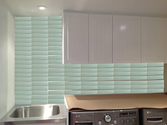
...uhm, not so good. I'm not sure why it doesn't work, but it doesn't feel right. Maybe because the horizontal lines of the cabinet, countertop, and tiles are too much? I think this pattern would work in a shower stall (it would be a modern take on the subway tile wall/accent stripe look) but it wasn't doing it for me here in the laundry room.
We could go with a classic brick pattern in a single colour. Oh, yes, I'm liking that. I never tire of the brick pattern, no matter how many times I see it.
HandyMan always prefers a more modern spin on things so here's an option he's happy with. The glass tiles set in a grid pattern take away from the "horizontal-ness" of the tile and make the 7' ceilings look taller.
What do you think? Which pattern would you go with? Or do have other suggestions on what we could do in here? We haven't bought the tile yet so we're still open to ideas!


2 comments