Style At Home Feature No.2
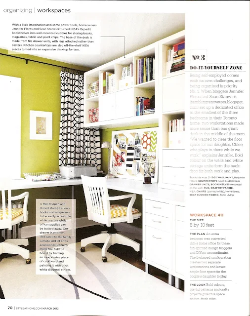
The fine folks at Style At Home really made full use of the photos they took at our house! Last month's issue featured the house tour and this month's issue (March 2012) features our home office in a roundup of four different workspaces:
The office looks so cheery and bright - and not the cluttered mess it usually is ;) If you've hopped over here from reading the article, welcome! You can see more about some of the office projects like the corkboard, the painted chairs, and the organization solutions.
As I flipped through the magazine, another little surprise awaited me in the Letters to the Editor section:
This person was talking about our story in the February 2012 issue and I was thrilled that they "got it". A big reason why I blog about our renovations and projects is to show you that DIY doesn't have to look, well, DIY'd. Count this as my favourite letter ever.


0 comments