Sarah's Houses: After The Show
Do you ever wonder what happens to the homes you see featured on your favourite HGTV shows? What do the homeowners really think of the rooms decorated by our favourite TV designers? Do they keep them as is? Do they keep all the furnishings? Or do they change the spaces so drastically that they bear little resemblance to what we saw on TV?
I gave you a peek into the small changes Geeta and Jerry made to their dining room which was transformed on Sarah 101 Season 1. But what about the famous whole-house transformations from the Sarah's House series? Have a gander at what some of these rooms looked like once the cameras stopped rolling:
Sarah's House 1:
Of all the Sarah's House houses, I felt this one I could move right into and not change a thing. I loved the silvery neutral palette and the cream and grey kitchen. The children's bedrooms and study room were dreamy and the metallic industrial inspired laundry was petite and perfect. Let's take a look at the rooms as Sarah left them and what they look like now:
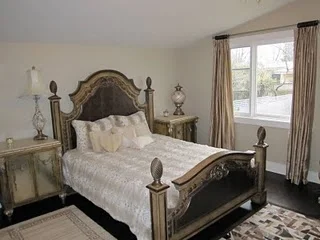
Master bedroom
Home office
Dining room
Girl's bedroom
Living room
Bathroom
And the Boy's bedroom
All before photos courtesy of Sarah Richardson Design. All after photos are from the real estate listing.
Overall, I don't think its a bad transformation. The current furnishings just don't have that pizzazz or showcase the rooms at their best. I'm glad that at least structurally, not much has changed. But if Sarah's House 1 is still your dream home, you're in luck because this home is currently for sale for a cool $1.329 Million.
Sarah's House 2:
Hold onto your hats Sarah fans, because this next transformation may just break your heart a little. Sarah's House 2 was a real diamond in the rough, a 1960's ranch backsplit full of hidden potential. Sarah brought it back to life by opening up and lightening up the interior and creating a spectacular backyard space. Who could forget the living room with the glass wall and hits of soft pink? Or the sweet baby boy nursery with the handpainted letters adorning the walls? My favourite though was the graphic green, black and white guest suite in the remodeled basement. I swooned over the upholstered headboard and the white painted bamboo armoire Sarah found at auction.
These After photos were from the real estate listing when the house was for sale in April 2010. I have no idea what the current interiors look like, but these ones... well, not much left to swoon at in my books.
Master bedroom
Basement


Kitchen
Laundry
Living room
Bathroom
And that adorable basement guest suite? Tragic, is all I can say.


All before photos courtesy of Sarah Richardson Design. All after photos via Carriage House Antiques.
Yes, its the same room. Goodbye whimsical wallpaper and bright white space. In reality, again much of the structure has stayed the same. But for me, the home owner's accessories and choice of paint colours have dulled the space, aged it, and made it seem less appealing. What do you think of the change?
As Sarah told me, the majority of houses she has redesigned go up for sale very quickly after she's laid her magic touch. I can't blame the homeowners - how many of us wouldn't want to live in a "Sarah" house (or capitalize and make some $ selling one)? I just know that if I ever were in possession of a Sarah's house, I probably want to buy all the furnishings too, lock, stock, and barrel.


0 comments