The Basement: Design Tools
When HandyMan and I start planning a room, we start by drawing and drawing and drawing. On the backs of envelopes, restaurant napkins, notebooks, old telephone bills, whatever scrap piece of paper is nearby soon becomes filled with our doodles. At some point though, we put those sketches into some electronic form so we can get a sense of space and style. There's nothing that helps to visualize a room better than a plan drawn to scale or a 3D version that you can move and twist about to get perspective.
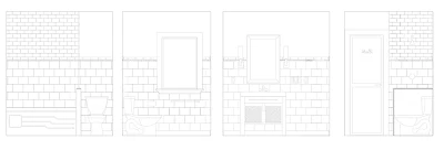
Usually, the first tool of choice in our design toolkit is AutoCAD, but that's only because HandyMan uses it every day in his day job and is very familiar with it. Its pretty nifty though for drawing up floor plans or elevations and adding in elements of a room like fixtures, furniture, and tile. It was really helpful when we were deciding on the tile pattern for the bathroom.

Usually, the first tool of choice in our design toolkit is AutoCAD, but that's only because HandyMan uses it every day in his day job and is very familiar with it. Its pretty nifty though for drawing up floor plans or elevations and adding in elements of a room like fixtures, furniture, and tile. It was really helpful when we were deciding on the tile pattern for the bathroom.

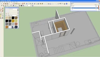
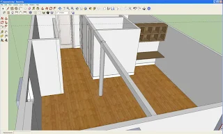
For getting perspectives though and 'walking' through a plan, we needed something with better 3D capabilities. Enter Google SketchUp. Free and easy to use, SketchUp helps you build 3D models and share them. There are tons of tutorials to help you and an online warehouse where you can search and use models others have created. Its also easy to populate your models with typical layouts (e.g L-shaped kitchen) or furniture (Ikea Expedit, anyone?) because somebody somewhere has already created the object in SketchUp. Here's a few perspectives of the basement that HandyMan created after using SketchUp for the very first time:


Pretty cool, eh? When you're planning a large space or multiple rooms, Google SketchUp is really useful. You can do things like add textures and colour, remove parts of the model (like exterior walls), and swoop in like a bird and see your plan up close.
Once we have the plan finalized, we then work on the finer details and decide on the look of room. I like to create mood or inspiration boards and put together images that help convey the style and feeling I want. You can use Photoshop if you have it (Making It Lovely does great inspiration boards) or use Polyvore, a free tool which even saves the online links to the items you put on your mood board. It worked great when I was trying out looks for the kitchen like this one:
and this one:
So that's what's in our DIY design toolkit. Can you tell we like to plan things out before we build? I'll be sharing some of our plans with you in future posts and illustrate how good planning really does help you design better.

