An Inspired Room Tour and Loving The Home You Have
But it can be a double-edged sword. In this world of visual stimulation, it can be easy to fall into a trap of wanting more and not being satisfied with what you do have. You find yourself comparing your home/furnishings/family with others and find it/they/you come short in some way. It's easy to lose sight and find difficulty in defining your own tastes when there are so many ideas floating around you.
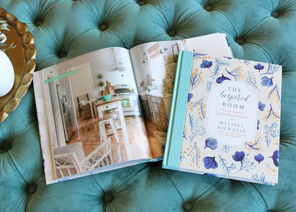
Which is why I loved receiving The Inspired Room: Simple Ideas to Love the Home You Have
Melissa asked a few bloggers to participate in The Inspired Room Tour and share a room we love in our own home, what inspired it, and how it has evolved. I thought I would share the room that brings me the most comfort and calm, our master bedroom.
We had lived in this house for three years before we renovated this room, which is surprising when you consider what it looked like before. But that is how it is with renovating some times... you put your focus and effort on the public spaces like the kitchens and bathrooms while bedrooms and private areas fall to the bottom of the list.
This room had a bump out on the wall which limited placement of the bed in the room and that really challenged us to find a creative solution. I think maybe that is why I love this room... in renovating it, Sean and I found our skills in designing and building really complemented each other; it's one of our first rooms that really felt like "us". Architectural details and timeless design, simple solutions with high impact - it's what I cherish and they're all combined here in this room.

I love that the feature you notice most - the panelled wall - is made of the most basic materials (mdf) and painted simply in white (Benjamin Moore Sea Pearl). In fact, the whole room (walls, ceiling, trim) is painted the same shade of white. This room gets the best light in the entire house and when the sun is shining, it's like a warm hug wrapping you up and lulling you to sleep.

If you saw this room when we first completed it in 2010, you'll notice that not much has changed. The bamboo blinds and the custom floral drapery from Tonic Living (which I still love to this day) continue to frame the custom radiator cover that Sean built. The capiz chandelier I bought on eBay a decade ago and had sitting in a box for five years still hangs over our bed.
No new furniture has been added nor taken away. When a space feels right and continues to work for you, then why change it?

I do change out the accessories though on our nightstands and on my vanity. It's a real bedroom so you'll see the stuff of life... clocks, moisturizers and hairspray, glasses for my aging eyes, and a few treasured personal photos. The wreath hanging over the bed (this is a new laurel one from Canadian Tire) is changed out seasonally and brings a hint of greenery I always crave but I can't keep flowers alive so faux it is. The bedding is another way to keep things fresh... though I do try different patterns yet always gravitate back to ticking stripes and checks. Oh well.
Chloe adds her bits to the decor too like acorns she picked up on a walk and this book she gave me for nighttime reading (it's a page turner!). She will on occasion climb into our bed, stuffed panda in tow, if she's had a particularly bad dream. I don't mind though. Those moments are fewer and far between and while I love this room, it's those moments lived in it that I truly cherish.
Do you have your own inspired room to share? Visit here for details on how to participate in the tour and for your chance to win a $300 Anthropologie giveaway.


